The Philadelphia School, deterritorialized

mélange

  z   5   b   c   d   e   f   g   h   i   j   k   l   m   n   o   p   q   r   s   t   u   v   w   x   y   z   6

1971

Mitchell/Giurgola Architects

United Fund Headquarters Building


2000.09.03
history of hypersurface architecture in Philadelphia
...plus maybe a "history of hypersurface architecture" in Philadelphia, e.g., the force-field of St. Francis de Sales Church; Institute for Scientific Information; Franklin Court; Welcome Park; and also the work of Kahn: Congregation Ahavath Israel, Alfred Newton Richards Medical Research Building and Biology Building, City Tower; [and also Giurgola's United Fund Headquarters;] and perhaps the best hypersurface of Philadelphia architecture, the work of Frank Furness, particularly the half castle bank facade (and this leads to Sullivan as a tangent).

Philadelphia
Small United Fund office building plays an important role in the urban scene

"In effect, it is a glass box surrounded by concrete screens where they are needed." With these few, simple words Architect Romaldo Giurgola sums up not only the distinctive character of the United Fund Building, but a whole philosophy of design as well.

In many ways, the architecture of Mitchell/Giurgola Associates typifies the work of several firms sometimes grouped together as the Philadelphia School. Disciples of Louis Kahn, these architects see design as the product of interaction between internal needs (Kahn's "existence will") and external circumstances. In this case, very simple internal needs--for a "box" of office space--have been acted on by compelling external needs--need for sun-screens, shape of site, etc.--and the resulting design symbolizes this interplay oh forces.

Like his Philadelphia contemporary, Robert Venturi, Giurgola feels that symbolism in design need not be hindered by Early Modern inhibitions about structural honesty. The United Fund Building is not literally a glass-clad box shielded by concrete screens, but it has been contrived to look that way "in effect."

The location along Benjamin Franklin Parkway, near the center of Philadelphia, determined just about everything about the form of the building. This broad boulevard, slicing across the gridiron plan of the city, shaped the trapezoidal site and left a small triangular park next to it--one of several public triangles along the parkway. And with the parkway location came a city-imposed height limit of 80 ft.--set to match the cornice line of the nearby cathedral and other major public buildings near Logan Circle.

This height limitation forced the architects to use virtually the entire trapezoid of land. That is not apparent, because the adjoining park looks like--but is not--part of the building's site. The long wall bordering the park, visible from blocks away across Logan Circle, naturally became the visual "front" of the building. And the opposite side, adjoining some row houses, became the "back"--a party wall with few openings except in the upper stories.

Walls of gray glass in thin, dark aluminum frames (right) are shielded from the west sun by a suspended screen of cast-in-place concrete. The bold horizontal pattern of this screen identifies the building from blocks away (far right) across Logan Circle.


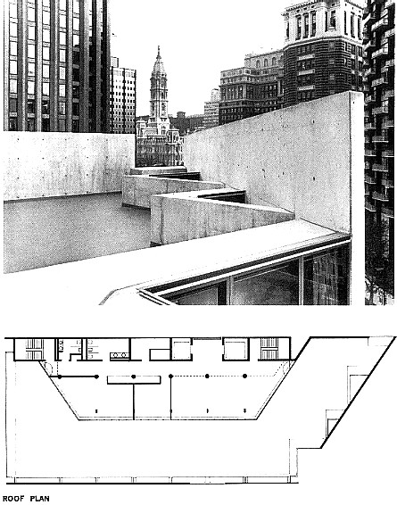
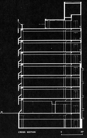
The three very different fronts on the north, west, and south respond to lighting conditions and--in the case of the bearing wall on the south--to structural demands. The building section shows duct space under the angular planes below the west windows; at the ground, one of these duct enclosures marks the property line along the park to the west. The architects' proposals for this park have not been adopted.


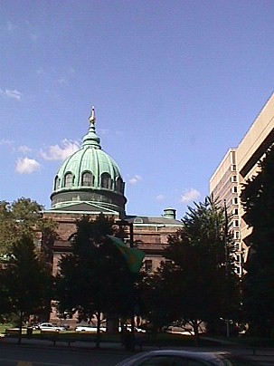
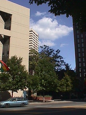
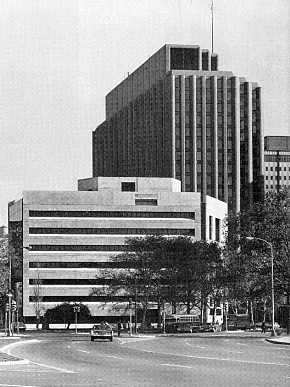
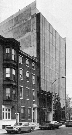
A building seen across an extensive open space had to present a strong image, if it was to be noticeable at all. Giurgola observes that a strong building form was needed at this point "in order to prop up all those giants around it"--those taller, bulkier, but rather amorphous piles that line the parkway to the east. And he stresses that no building is ever an isolated event.


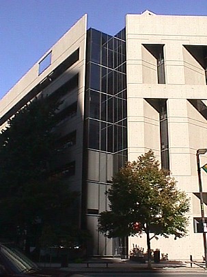
And it was the location, of course, that determined the widely differing treatment of the building's three exposed walls. On the north side, where direct sun is a minor problem, the whole facade is of gray-tinted glass in thin aluminum frames, allowing floor-to-ceiling views out over the roofs of the cathedral across the street.

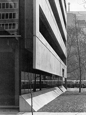
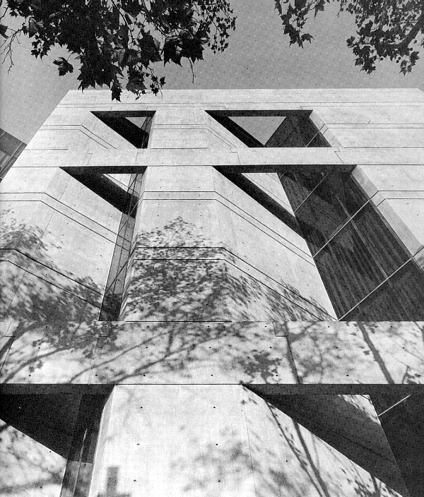
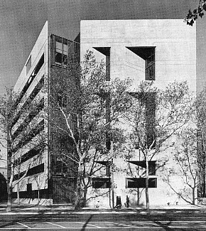
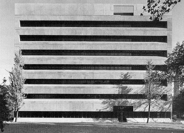
On the west, the urge to give office floors full exposure to a panoramic view and the need to protect them from west sun led to the design of the concrete screen, with its horizontal openings set about 1 ft. below the corresponding windows. Even though conventional wisdom calls for vertical sun-baffles on west walls, the architects claim that this horizontal design gives better protection against the high summer sun, which is most critical, and cuts out sky glare as well. The fact that this whole screen is suspended from the floor slabs is pointedly expressed on the exterior by detaching it from the ground.


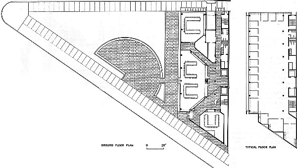
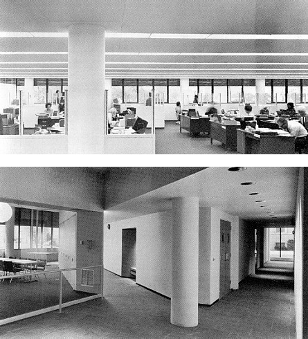
Conditions on the south wall called for sun protection, too, but it took a very different form. A bearing wall was needed here, to pick up loads from the column-and-beam concrete frame where it is cut off at an odd angle. Windows on this side are set into recesses whose walls line up with the 3-ft.-square grid of interior partitions and lighting. Projecting corners of the building provide enough sun control here, without special shading devices.

One obvious question comes up concerning the facades: why are the two very different screens on the south and west sides--one supporting the structure and the other suspended from it--both made of cast-in-place concrete? Two reasons, replies Giurgola:

1. to preserve the unity of the building. (The sides may differ, but the inner plane is always of glass, the outer one of cast-in-place concrete.)

2. because concrete was readily "moldable" to meet complex needs. (The west screen is "not just a plane," but folds back around the windows and provides duct spaces behind the angled planes at the sills.)

And the plane of concrete gives the west front the visual solidity the building needs for its position in the cityscape. A screen composed of smaller-scaled elements would not have read as one unified plane from a distance, as this screen definitely does. Yet somehow the horizontal baffles, streaking across the facade with so little apparent support, look inherently unstable--like a giant venetian blind. And the unbroken horizontal lines--while they help distinguish this building from its neighbors--contrast so strongly with other parts of the same building that it tends to break apart visually; Giurgola knows this, of course, and is willing to chance it.


At the southwest corner of the building, between the two big screen-walls, is a glass-lined notch where the main entrance is located. The broad double doors are distinguished from the dark glass walls around them only by their clear glass and polished stainless steel frames.

Inside this entrance, a diagonal corridor leads straight to the elevator core at the center of the "back" blank wall. This diagonal passage and a corresponding one on the other side of the core link all the conference rooms on this floor together. The angular layout provides well-shaped meeting rooms and leaves generous alcoves outside them for casual encounters. Dark glass partitions between the corridors and the meeting rooms (except for the more private one in the south corner) give the whole lobby area views of the park to the west, through layers of interior reflection.


West windows of a typical office floor need no blinds and offer broad views; ceilings are designed to recover heat from lighting strips. Dark glass around ground floor meeting rooms can be screened with drapery. The roof deck affords a good view toward City Hall. The intersection of the angular end wall with window walls repeats at small scale the relationship of Benjamin Franklin Parkway to the city's street system.

The typical floors are loft spaces with circular columns forming 15 by 40 ft. bays. The long strips of window on the west front need no blinds at all. Air is supplied through the sills and exhausted at the window head with no obstruction.

The combination of concrete sun-screen and dark gray glass gives virtually every worker a glare-free vista down the parkway to the Philadelphia Museum of Art and the vast park beyond it--at least where the space has been left unpartitioned, as the architects recommended. The angular spaces at the south end of each floor are well suited for private executive offices. Floor-to-ceiling windows in these offices (equipped with drapery) provide side-long views west along the parkway, and those at the southeast corner have windows facing east toward Philadelphia's unique City hall.

At the top of the building is a penthouse with employee's cafeteria and lounge, opening onto a roof deck. On two sides of the building, screen walls rise a fill story above the deck to match the cornice height required by the city's Art Commission. Only at the gap above the entrance and at the very deliberate "window" cut through the west screen (which is aligned, for purely symbolic reasons, with the buildings vertical core) can the fine view of the west be seen. The effect from the cafeteria is like looking through a peephole. It seems perverse to have blocked off such an exceptional view (even though most employees can look the same way from their desks on floors below).

Undoubtedly, Giurgola was determined not to let the profile of the building trail off at the top with a stack of diminishing penthouses (as most of its larger neighbors do). Then too, he must have considered the height limitation a bit arbitrary, considering the much greater heights allowed on blocks immediately to the south and east. What better way to indicate an arbitrary height restriction than with these great concrete planes, seen in sharp profile against the sky?
John Morris Dixon, "Philadelphia" in The Architectural Forum (January/February 1971), pp. 40-5.


Facts and Figures
Headquarters Building, United Fund of the Philadelphia Area, Philadelphia, Pa. Architects: Mitchell/Giurgola Associates (John Lawson, project architect). Engineers: Harry Palmbaum (structural); Paul H. Yoemans, Inc. (mechanical and electrical). Interior design: HMC Interiors, Inc. (with the architects). General Contractor: Hughes-Foulkrod Construction Co. Building area: 66,270 sq. ft. Cost $2,375,000 (plus 36,820 for furniture and equipment).
Photographs: Rollin R. La France.


2005.03.15
notes
1. ...an exhibit of Giurgola free standing facades--Columbia HS, PennMutual, Tredeffrin Library, Columbia Univ., Princeton (replaced by VSBA), Australia, and the United Way--as "proto" (except for Kahn "wrapping ruins around buildings @ Exeter).
3. do a full reenactment trail before and after Kahn's Media convent. Luckily, my thesis comes before Gehry's Winton Guest House. ...including the precedents I presented at thesis.

««««

»»»»


www.quondam.com/40/4015f.htm

Quondam © 2018.10.19