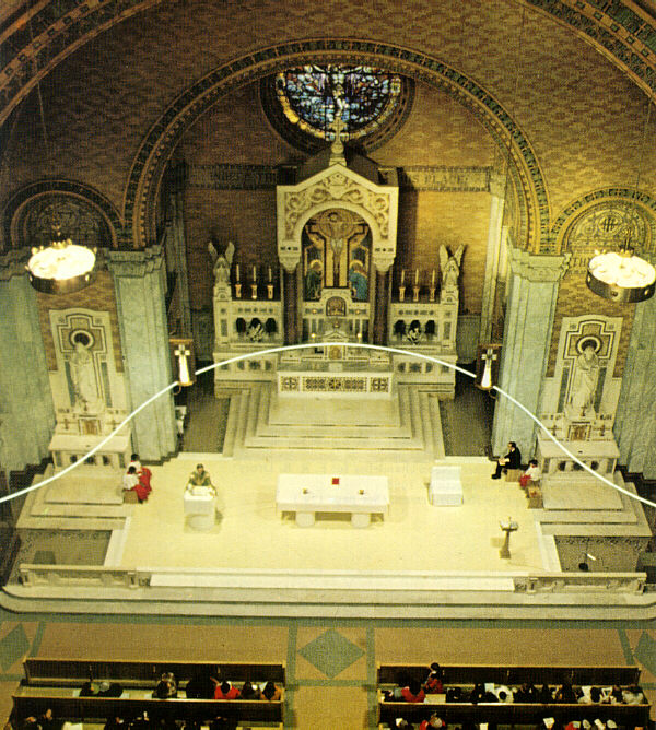
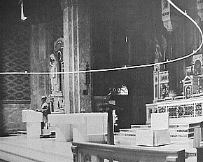
For the Philadelphia church of Saint Francis de Sales, Venturi & Rauch changed the focus from the original neo-Byzantine sanctuary to a new-liturgy arrangement by means of a kind of electric demolition (1968). As if they were making an editor's deletion on the statement of the original sanctuary, they literally drew a line through the old altar and its reredos, editing it out. That line is a cold cathode tube of light suspended on piano wire, ten feet above the church floor, following the gentle curve of the apse. The tube cancels out the old altar with the intensity of its electric light; yet the original statement can still be seen behind, as if in the distance.
This demolition is doubly literary in that, it is analogous to a deletion rather than being an actual one, and second, it alludes to literary or editorial procedures. In the "electric age" this is a pivotal example of the architecture of allusion. In addition, the result is a milestone of church art and a new church image. The decision to preserve the old altar was made by the architects because they felt that its jewel-encrusted craftsmanship should be retained as an expression of the church's historical continuity. That was a decision unlike the wiping away of historical ornamentation that was indulged in by the purgative "clean" designers of the 1950s. The architects also used the line of electric demolition to focus on the new furnishings of the new sanctuary. "The shape of the magic line cathode," as Venturi called it, is not the only element that defines the new sanctuary, of course, but it is the most supermannerist of the church's innovations. As other furnishings, the congregation required a lectern and a priest's chair in addition to the freestanding altar table. To match the new liturgy, the architects provided a completely new image for these furnishings. Three shiny objects of white plexiglass and white vinyl, with accents of yellow vinyl and plexiglass, are set amid the neo-Byzantine surroundings. The translucent soft-curved hard plastic panels and the soft hard-edged, wet-looking vinyl in a church look like Claes Oldenburg gone pious. The architects knew, as Venturi said, that they "could not get harmony through similitude" in these new furnishings because they could not afford, much less surpass, the richness of materials--marbles, jewels, and mosaics--that had been possible when the church was built in 1907. As a consequence, they sought "harmony through contrast." The plexiglass is similar to, yet contrasts with, the marble; the soft furniture contrasts with the usual church furniture yet has harmonious forms.
Unfortunately, that design image was too totally new for a large segment of the congregation of Saint Francis de Sales. Seven months after installation, "electric demolition" took on a double and sadder meaning when the congregation removed the cathode-tube light to a storage room. They thereby blindly demolished the architect's imaginatively allusive scheme, leaving only the acrylic and vinyl furniture intact.
C. Ray Smith, Supermannerism: New Attitudes in Post-Modern Architecture (New York: E. P. Dutton, 1977), pp. 256-8.
| |
| |
2000.09.03
history of hypersurface architecture in Philadelphia
...plus maybe a "history of hypersurface architecture" in Philadelphia, e.g., the force-field of St. Francis de Sales Church; Institute for Scientific Information; Franklin Court; Welcome Park; and also the work of Kahn: Congregation Ahavath Israel, Alfred Newton Richards Medical Research Building and Biology Building, City Tower; [and also Giurgola's United Fund Headquarters;] and perhaps the best hypersurface of Philadelphia architecture, the work of Frank Furness, particularly the half castle bank facade (and this leads to Sullivan as a tangent).
2005.05.23 14:27
hotrod architecture
Anyone familiar with Venturi and Rauch's Renovation of St. Francis de Sales, Philadelphia 1968 (which is best illustrated in the original Learning From Las Vegas) will have to agree that it was a bone-fide "hot rod" design. Sadly, the design is no longer in place (but at least the white plastic lectern still exists, albeit in storage). The single tube of white neon that hovered over the church sanctuary apparently didn't last long at all. Like the ecumenical changes of Vatican II, the Renovation of St. Francis de Sales was indeed an "extreme makeover."
| |
2014.09.05 11:30
Why Modern Architecture Struggles to Inspire Catholics
The restoration design was quite a unique interpretation of the precepts of the Second Vatican Council. Like the neon line, however, a segment of Church followers were not happy with the Second Vatican Council's 'new' Church either.
The furniture, especially the lectern (and here D might well agree since I'm sure she and I both saw and closely examined the piece), has a very ethereal quality--albeit basically white Plexiglas, the lectern has an almost 'supernatural' gravity while at the same time an almost anti-gravity lightness, not unlike the quality most often attributed to a deity.
|